Get bulk orders for 30% less than local suppliers, plus free samples.
Get bulk orders for 30% less than local suppliers, plus free samples.
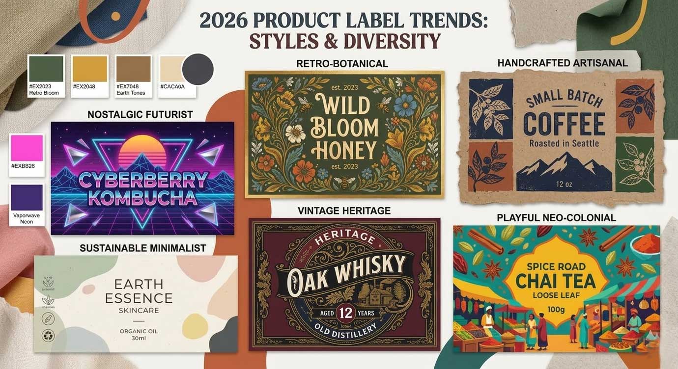
In 2026, labels are no longer just visual cues—they become invitations to touch, memory triggers, and honest contracts.
Five major trends reshape the silent conversation between brands and consumers.
The product label has never been just a label. It's a handshake, a promise, a moment of persuasion that happens in the three seconds between a shopper's glance and a purchase decision. But in 2026, something fundamental is shifting.
For the past decade, label design has been pulled in opposing directions. On one side, minimalism demanded clean lines, stark white space, and clinical precision. On the other, maximalism shouted for attention with bold colors and crowded compositions. Both approaches, however, shared a common flaw: they treated the label as a purely visual medium.
2026 marks the end of that limitation. This year's trends reveal a label that engages more than just the eyes—it touches the hand, tugs at memory, signals honesty, and invites belonging. The label is becoming a multi-sensory bridge between brand and buyer. Digital fatigue, AI saturation, and value realignment are the three forces driving this evolution. The five trends that follow respond to people's hunger for comfort, authenticity, sensory connection, transparency, and belonging.
What it is
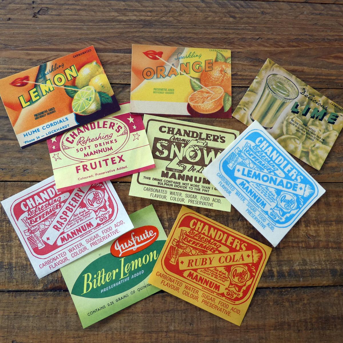
Retro-inspired colors, vintage typography, and heritage-style illustrations that tap into emotional memory.
In uncertain times, familiar design cues feel like a warm handshake. Brands like Olipop, Coca-Cola, and Kellogg's have proven that throwback packaging drives both emotional connection and actual sales. Pinterest reported massive search increases for vintage aesthetics heading into 2026, and limited-edition retro releases are creating urgency and collectibility across food, beverage, and beauty categories.
Muted color palettes in dusty pinks, sage greens, and warm creams. Serif or script typefaces with vintage character. Hand-drawn illustrations or woodcut-style graphics. Uncoated or textured paper stocks that feel warm to the touch.
This isn't about copying old designs exactly. The brands doing it well blend retro elements with modern clarity. Think vintage colors paired with clean ingredient panels, or heritage-inspired illustrations on contemporary bottle shapes.
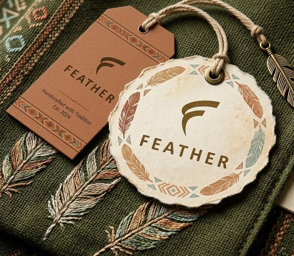
Hand-drawn elements, visible brushstrokes, irregular lines, and intentionally imperfect details that reveal human craftsmanship.
As generative AI floods the market with perfect, frictionless visuals, consumers are developing "AI fatigue." A 2025 study found that 62% of young consumers expressed skepticism toward visuals they suspected were AI-generated. Handmade marks offer the opposite: evidence of a real human hand, with all its charming imperfections. Small-batch brands, craft food producers, and even large corporations are using human-made design cues to differentiate themselves from algorithm-generated sameness.
Rough-edged illustrations that look sketched rather than rendered. Hand-lettered typography with inconsistent stroke weights. Visible eraser marks, ink bleeds, or watercolor textures. Stamped effects where alignment is intentionally off. Raw paper stocks that absorb ink unevenly.
Authenticity can't be faked with filters. The best handmade marks are either genuinely hand-created or digitally produced with such careful attention to imperfection that they fool the trained eye. Avoid making imperfections feel systematic—true handmade looks organic, not algorithmic.
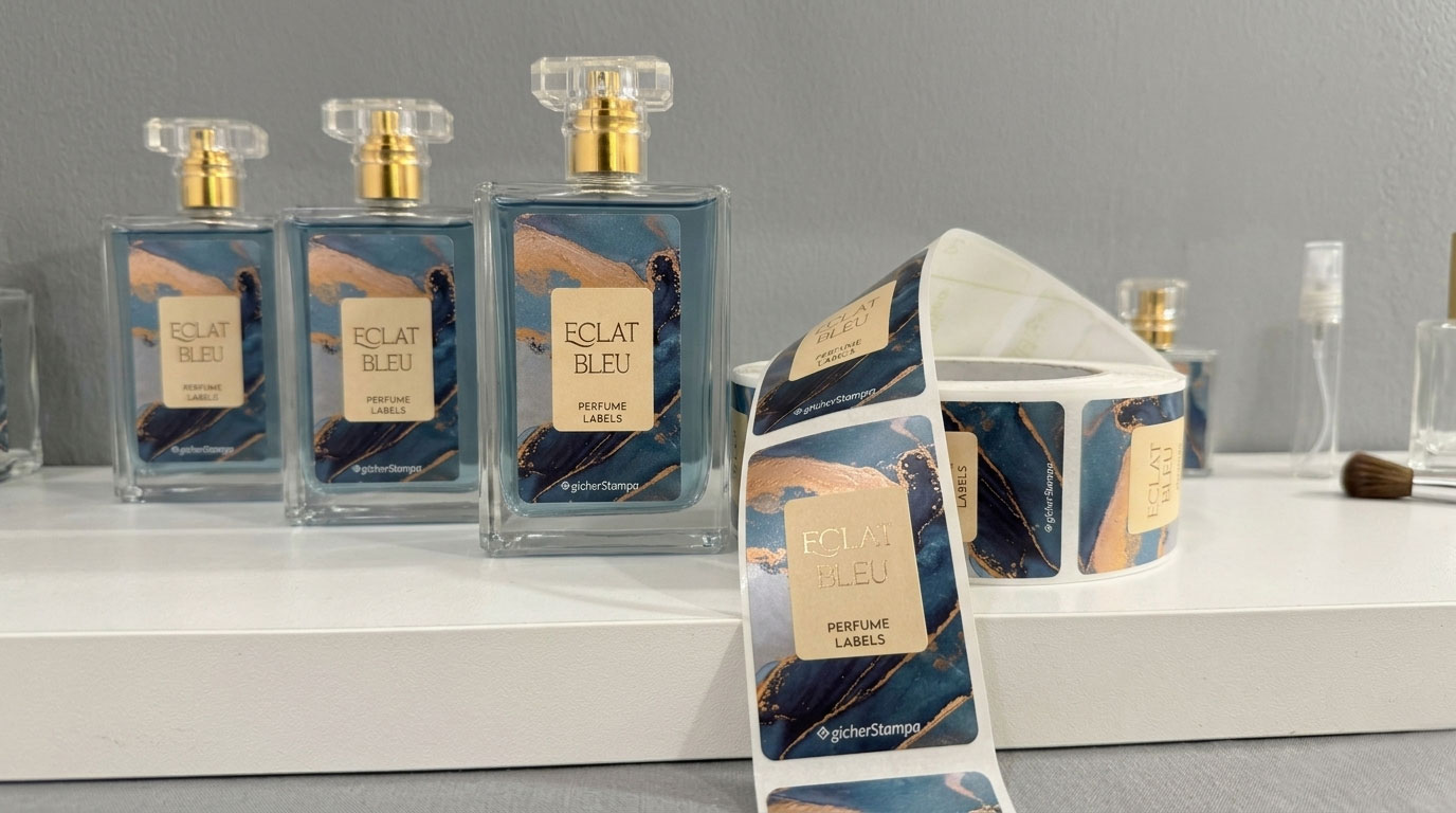
Physical surface treatments—soft-touch coatings, embossing, debossing, textured substrates, and dimensional varnishes—that invite tactile interaction.
We live on screens. The average adult now spends over seven hours per day looking at digital displays. As digital experiences dominate daily life, physical tactility becomes precious and novel. Neuroscience research shows that tactile processing activates emotional brain regions more strongly than visual processing alone. Soft-touch says luxury; rough recycled stock says earthy and honest.
Soft-touch laminate with a velvety, almost suede-like feel. Blind embossing of logos or patterns. Debossed ingredients lists. Cork, uncoated cotton paper, or recycled pulp with visible fibers. Spot gloss over matte backgrounds to create contrast textures.
Texture must match brand personality. A kombucha brand might use rough, recycled texture to signal health and earthiness. A luxury skincare line might use soft-touch to signal indulgence. The worst mistake is adding texture for no reason—tactile elements should reinforce what the brand wants you to feel.
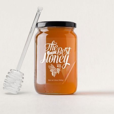
Clear or nearly invisible labels that allow the product itself—its color, texture, clarity, and physical form—to become the primary visual element.
Consumers no longer trust what they can't see. The clean beauty and clean food movements have trained shoppers to want visual proof. A clear label leaves nowhere to hide: you can see the actual liquid, cream, or food inside. This literal transparency has become a metaphor for brand honesty. Additionally, minimalist aesthetics continue to dominate premium design, and nothing is more minimal than a label that barely exists.
Clear film labels with no white backing. Direct-to-container printing where ink sits directly on glass or plastic. Small, understated typography in black, white, or metallic foil. No background graphics, no illustrations—just essential information presented cleanly.
Radical transparency only works when the product inside looks good. If your liquid is murky, your cream separates, or your food looks unappetizing, clear labels will hurt rather than help. This trend rewards brands with visually appealing formulations—and punishes those without. It also requires scrupulous supply chain honesty.
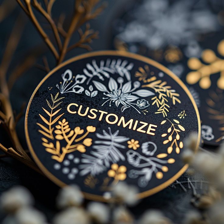
Premium design that prioritizes approachability, warmth, and invitation over cold exclusivity and unattainability.
Traditional luxury aesthetics—stark white space, mirror-finish metallic foils, austere sans-serif typography—feel increasingly out of touch with contemporary values. Younger affluent consumers, who will control 70% of global luxury spending by 2026, reject "you can't afford this" aesthetics in favor of "you belong here" energy. Brands like Glossier, Aesop, and Moleskine pioneered this shift. In 2026, warm luxury is going mainstream across spirits, skincare, candles, and even packaged foods.
Warm neutral color palettes: cream, terracotta, olive, oatmeal, clay. Paper stocks with natural fibers and soft rounded corners. Copper, champagne gold, or brushed brass foils instead of mirror-like silver. Handwritten-style batch numbers. Conversational microcopy ("a little something for your morning") rather than imperious brand statements.
Warm luxury is a delicate balancing act. If you go too warm, you lose the premium signal. If you go too luxurious, you lose the warmth. The sweet spot uses premium materials (thick paper, subtle foils, soft-touch coatings) but presents them in a generous, almost casual way. Think handwritten numbers on heavy stock, or a warm terracotta background behind a small, elegant foil logo.
Look across these five trends, and a single pattern emerges. Nostalgia brings comfort in uncertain times. Handmade marks offer proof of human presence against AI sameness. Touchable textures satisfy a hunger for physical connection in a digital world. Radical transparency answers a demand for visual honesty. Warm luxury replaces cold distance with genuine invitation.
Each trend, in its own way, is fighting the same battle: against distance, against artificiality, against the sterile perfection that has come to dominate so much of modern commerce. For brands planning their 2026 label strategies, the implication is clear. Don't ask "What looks good?" Ask instead: "What does this label make people feel?" Does it feel familiar? Does it feel human? Does it feel good to touch? Does it feel honest? Does it feel welcoming?
The labels that succeed in 2026 won't just be seen. They'll be felt, remembered, and trusted.
| Trend | Core Emotion | Primary Driver | Risk to Avoid |
|---|---|---|---|
| Nostalgia Play | Comfort | Cultural uncertainty + reminiscence bump | Looking like a costume |
| Handmade Marks | Authenticity | AI fatigue + desire for human evidence | Fake imperfections that feel algorithmic |
| Touchable Textures | Sensory delight | Digital fatigue + neuro-tactile reward | Texture without meaning or brand fit |
| Radical Transparency | Trust | Ingredient skepticism + minimalist aesthetics | Ugly product inside or dishonest supply chain |
| Warm Luxury | Belonging | Rejection of cold exclusivity by younger affluents | Losing the premium signal entirely |



 +8618128095554
 sales@stickerforgeco.com
 +8618128095554